There are two types of color theories: artistic and scientific. The former is concerned with the human perception of color and how it relates to fine arts; the latter is concerned with the nature of color and describes them through different color models.
The ideas about color in both fields are complex. Thus, as much as I want to, I cannot discuss them in their entirety in this article. This tutorial is only meant to answer the most fundamental questions in both fields. Let’s dive in.
How Do We See Color?
Visible light is a combination of electromagnetic waves and particles called photons. Light sources, such as the sun or electric bulbs emit photons in large numbers.
The frequency of visible light waves will determine its hue. For example, the color red has a long and low frequency, while the color blue has a short and high frequency.
The amplitude of visible light waves will determine its brightness. Waves with high amplitudes produce bright light while waves with low amplitudes produce faint light.
Lastly, the purity of visible light waves will determine its saturation. Single wavelengths have the purest color. The higher the number of wavelengths that comes with light, the less pure or less saturated the light becomes.
These rays will travel through space until interfered. Most of the time these light rays will hit an object which then reflects them into our eyes. However, sometimes, our eyes absorb them directly from the light source.
Whether these colors are directly projected to our eyes or are reflected by an object will determine how we evaluate and apply them to our photographic work.
In particular, it will determine which color system we use.
Subtractive Color System (CMYK)
The subtractive color system applies to physical media. Whenever we mix ink or paint, we are implementing the subtractive color system.
When light hits an object, say a printed image, the picture absorbs some of the light and reflects the rest of it. Which wavelengths are reflected will depend on the properties of the image.
 When reflected light rays hit our eyes, it triggers our Photoreceptors. Photoreceptors are nerves in our eyes that relay light information to our brain. The brain then processes this information and determines the image that we see.
Printers use the subtractive color system known as the CMYK color model. The primaries in this color model are Cyan, Magenta, and Yellow; K is a shorthand for the printing term key plate.
The subtractive color mixing starts with white and ends with black. Each subsequent color added results in a darker color that tends to black.
 You might have noticed that your printer does not carry white ink. This because the subtractive color system has no way of producing the color white. That is, there is no combination of pigments that you can add that will create white.* The color white seen on prints come from the fact they are printed on white paper.
*White ink does exist, but it is costly and rarely used because of impracticality.
The RYB Color Model:
Most of us learned in grade school that the primary colors are Red, Yellow, and Blue (RYB). RYB is another form of the subtractive color system. It was the dominant color system for centuries until CMYK gained popularity in the printing industry. Today, the RYB model is used mainly in painting while the CMYK model is used in printing.
Additive Color System (RGB)
How we see colors when objects reflect them is different from how we see them through a direct light source.
The additive color method applies to color absorbed by our eyes directly from the light source: all digital cameras and the entire Web work on the principles of the Additive Color System.
 When you see your images from a computer display, what you are seeing is light projected by tiny dots called phosphors. When charged, phosphors emit light, creating the colors that we see in our screens. Each phosphor emits just three different colors: Red, Green, and Blue (RGB). Computer displays project each phosphor with varying brightness to create different colors.
As such, the primary colors of the additive system are red, green, and blue (RGB), with the secondary colors of the additive system being yellow, magenta, and cyan.
Mixing colors in the additive system begins with black and ends with white. As you add more color using the additive method the subsequent colors tend to white. Since pure white light constitutes the entire spectrum of colors, adding all colors together should result in white.

For example, when none of the phosphors (RGB) are charged, the computer display will appear black. On the other hand, when all three phosphors are charged with equal and high intensities, the computer display will appear white. When only one of the respective phosphor is excited, the colors red, green, and blue are projected.
The RGB model has a bigger color gamut than CMYK. Color gamut determines the range of colors that a color model is capable of producing. Since RGB has a larger color gamut, not all colors created using the RGB color model can be reproduced using the CMYK color model.
As photographers, It is not necessary for us to understand the principles of electromagnetic energy. However, I believe it is useful to understand the fundamentals of light and color if we are to take advantage of them in our works fully.
Color Wheel

The color wheel doesn’t exist in reality. It is an abstract creation intended to illustrate how different colors relate to one another and help simplify the work of artists.
To create the color wheel, we would begin by taking three primary colors and putting them into a circle. Each of the primary colors should constitute a third of the ring.
If we take the areas where two of the primary colors border and combine them, we will get the respective secondary color. We can complete the color wheel by repeating this process.
You’ll notice that this approach ends up with the same color sequence as the rainbow. This concept provides the foundation for understanding how colors relate to nature.
You may be wondering why so we have a ring instead of a strip of a rainbow? The reason for its shape is to make it easy for artists to figure out the different color combinations they can use in their work.
Artists use the color wheel as a reference for finding combinations of colors that will work harmoniously with one another. Or, they use it as a reference when trying to figure out what mood they are trying to convey.
The ideas about colors used by artists, such as formulating attractive sets of colors, apply the same way in all color wheels, be it RGB, CMYK or RYB. This is because the relative position of colors on all color wheels is constant.
Introduction to Color Temperature

Colors temperature is not an intrinsic property of color. When we say color temperature, we are not referring to an actual physical heat that colors possess. Instead, what we are referring to is the humans’ perception color.
For example, we tend to associate the colors yellow and red with warm elements such as sunlight or fire. On the other hand, we associate the colors blue and green with cool elements such as water and grass.
Note that perceived color temperature is often contingent to other colors present within a scene. No color is warm or cool by themselves. For example, when you combine red and green together, it is easy to identify which color is warm and which is cold. However, when only green and blue are present, some may consider green as warm and blue as cold.
Color Temperature and Mood
Most artists use color temperature to influence the way their audiences interact with their images.
In general, artists use warm colors to generate emotions of happiness and excitement and use cool colors to invite a more relaxing and calm mood.
That said, it’s important to note that the way your audience interprets color temperatures will vary depending on different factors. Cool colors, for example, can remind us of clear blue skies which can make us feel calm and relaxed. However, depending on our state of mind, cool colors can also remind us of dreary weather and make us feel alone and isolated.
In the same way, warm colors, such as red and yellow, can remind us of fire and blood and arouse feelings of passion; at the same time, they can also remind us of a bright sunny day and make us feel warmth and comfort.
To be sure, there will always be cultural biases in the way audiences react to color. Some cultures may see the color red and interpret it as a danger, while others will understand it as happiness and energy.
That said, colors also influence us based on our biology. We will always relate red to fire and blues to water, and greens to grass.
Color Temperature and Photography
Utilizing warm colors in your images can stimulate moods ranging from warmth to excitement. Using cooler colors, on the other hand, will generally boost a calmer and more relaxing feeling.
 There are several ways you can influence the color temperature in your image. One of the most common and perhaps most natural ways to do it is to find specific subjects with the color temperature you want.
For example, if you want to tell a story that exudes radiance and purity, you could choose to photograph a snow-covered scene. On the other hand, if you want an image that provokes feelings of peace and tranquility, then perhaps a photograph with clear blue skies and green grass will do.
Another way you can change the overall color temperature of your image is through light.
As the sun moves across the sky, the color palette of our surroundings can vary, from cool blues to warm reds. Use this to your advantage. Photograph at different times of the day and let the ambient light smear your subject with its tint.
Different aspects of light affect your subjects differently. Simple sunlight poking through the clouds can dramatically alter the mood and visual story of your composition, as we can see on the right image.
Take photos during mid-day for a fresher mood or at sunset for a warmer glow. Whatever you choose, remember that saturated colors are dominant and can readily grab the viewer’s attention. To create a more serene and meditative feel, go for muted colors in your image.
Color Temperature and Depth
Our perceptual systems naturally see warm tones before cool tones. Warm colors tend to pop and appear as though advancing upon the viewer. Conversely, cool colors tend to look as if receding from the viewer and into the background.
Let’s look at the images below as an example. Notice that the hallway with a red (warm) wall appears shorter than the hall with a blue (cool) wall. Objects with warm color palettes tend to advance, while objects with cool color palettes tend to recede in the background.

Shooting a cooler colored subject(s) against a warm-colored background will make your subject(s) lose the desired attention to the background. The warm-colored background will compete with and push the cool colored subject back.
With this in mind, it will help to place warm colors on or around desired focal points in your composition. Doing this will help your viewers see them first and help guide them across your image.
When using color temperature to guide your viewers across your image, it’s wise to pay attention to their relative brightness and saturation. Regardless of color temperature, the brightest object in an image will naturally grab the attention of the viewer first. (More on this later)
Color Harmonies
Color harmonies are different color combinations that are said to be aesthetically pleasing and harmonious. Below are a few color harmonies you can use when working on your photo.
Complimentary Colors
Complementary colors are colors that are opposite on the color wheel. They are high in contrast and draw maximum attention. This color scheme works well when pairing warms colors with cool colors. To use complementary colors effectively, you must balance the saturation of the colors you will be using. That is, one should be more saturated than the other to balance out their effect.
 Analogous Colors

Analogous colors are next to each other on the color wheel. When using analogous colors, choose one dominant color and one color immediately to its sides.
The combination of these colors is smooth and pleasing to the eye.
 Triadic Colors

Triadic colors are equally distant from one another on the color wheel, as seen on the right. Similar to complimentary colors the triadic color scheme offers high contrast while maintaining harmony. One helpful tip when using the triadic color scheme is to use one color more often than the others or else the effect can be overwhelming
Triadic is hard to measure in real life but there are tools online and photo editing software to help you get the right distance.
Split-Complementary Colors

This color scheme resembles the complementary color scheme. It uses one dominant color and combines it with the colors on either side of its complementary color. This scheme is high in contrast but has minimal tension. Be cautious when using this combination as balancing the three colors can be difficult. One method of balancing is using one warm color balanced by two cool colors but be sure to stay away from desaturated warm colors.
 Color Value in Digital Photography

Color has three components: Hue, Saturation, and Brightness.
Hue is based on the frequency of reflected light, as we talked about earlier. It is an innate property of objects. When people think of color, they typically think of hue. All hues are created using red, green and blue.
Saturation is the dominance or purity of color. When you reduce the distance between the three primary colors, you are desaturating the color. That is, the more green and blue you add to pure red the less “pure” or less saturated it becomes. This process of desaturation is very different from traditional painting. In painting, we are taught to desaturate by adding white, grey or black to our paint.
Brightness is the luminance of a color. It is determined by the wave amplitude of visible light. Each color has its own level of brightness. For example, pure yellow is brighter than pure red.
Value refers to relative brightness between colors. It is dictated by both a color’s hue and saturation. Let’s look at the color wheel in grayscale below. You can see that pure yellow is brighter than pure blue. But a desaturated version of yellow has the same value as the desaturated version of blue.

Recall from earlier that adding colors in the additive color system tends to white. This is why saturation affects value. Desaturating a color means reducing its dominance by means of adding two other primary colors. Thus, desaturating a color leads to brighter values.
When we look at colors, it is easy to see only their hues and neglect their value. However, most often, it is the color’s value that will have the most significant impact on the success of your image.
The values in composition determine the order in which the viewer will navigate through an image. The viewer’s eye will generally go to the brightest part of the image first.
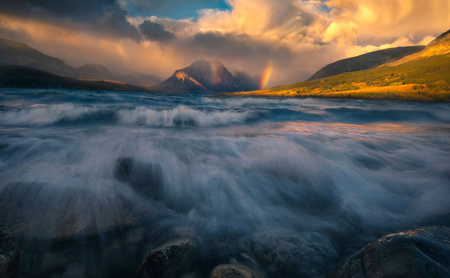
For example, in the image below, we can see that the background has plenty of contrast in value. The values of the elements in the foreground, on the other hand, are practically the same. The similarity in values in the foreground makes it challenging to identify the different colors in it. In addition, the foreground is also dark relative to the background. As a result, the viewer is likely to look at the background first and ignore the foreground.

It is the relative brightness of your subject, more than its hue, that will have a more significant impact on whether or not it stands out. The original foreground in the image above had plenty of colors and contrast, but because I adjusted its brightness and saturation in post-processing, I can direct the viewer’s eye’s to my subject–the mountains.
Value is also influential in creating the illusion of depth. Let’s use the image below as an example. Many factors contribute to the perception of depth in this picture. And one of the key players on that is the contrast in value.

I edited this image so that the foreground cactus is brighter than the rest of the cactuses. I also enhanced depth by increasing the contrast in value between the mountains in the background. Specifically, I made the closer mountains relatively darker than the farther mountains. Objects that are close in value will look flat- no matter it’s hue, shape, or texture.
Even color harmonies won’t work well if the contrast in value between the elements in your image is low. Let’s look at the images below. The two circles on the left have colors that are opposite in the color wheel (complementary). When paired, the high contrast between them is said to create engaging designs.
I adjusted their values in photoshop to get the two circles on the right side of the image. We can see that, when I made the values closer to each other, what we get is a dull color combination.

Their values can be seen in the greyscale below:
 Many colors have similar values. If you only pay attention to hues instead of values, you may end up with a photo that in theory should have plenty of contrast but doesn’t in reality.
Color is the most beautiful quality of a picture, but value plays a more critical role in its success.
