Mistakes are a common part of photography, especially when you’re just starting out.
But, the problem with making mistakes as a beginner is that you typically struggle to identify the mistakes you make. You may be able to sense that something is missing in your pictures, but it’s often difficult to identify what that problem actually is.
So, I decided to compile some of the most common compositional mistakes beginners make to help you expedite your learning.
1. Not Paying Attention to the Relative Brightness of Objects

Most beginner photographers don’t pay attention to the relative brightness of elements in their composition. But not doing so can make even the best photographic opportunities go to waste.
The audience is bound to look at the brightest part in images first. So, it’s crucial to be deliberate in where you place it within your frame.
Typically, you’ll want the brightest object to be around your subject or focal point. This will help your subject stand out.
Look which objects have the brightest color and which are more illuminated than others. Be sure to control them in a way that will draw attention to your subject and not away from it.
Resource: A Landscape Photographer’s Guide to Color Theory
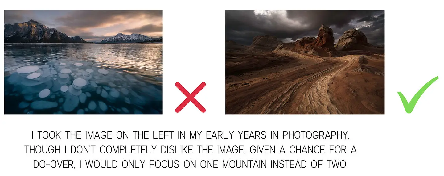
2. Always Centering Subjects
Placing your subject in the center of the frame seems like a natural thing to do. But, most of the time, doing so will only serve to make your images appear static and dull.
As you go on to study photography, you will likely hear about compositional rules such as the rule of thirds and the Golden Ratio. These rules discourage placing your subject at the center of the frame.
Instead, they suggest placing your subjects off-center to create a more intriguing and well-balanced composition.
Caveat: Keeping the subject or the object in the center can work wonders in some compositions. But the keyword here is some. Most of the time, placing your subjects at either end of the frame will likely work best.
Resource: 23 Composition Techniques for Travel Photography
3. Leaving the Foreground Empty

When taking pictures, most beginners tend to focus on the middle ground and background and leave their foreground empty.
But adding interesting elements in your foreground can help elevate your photos in many ways.
For instance, including rocks or plants in your foreground is a great way to convey a sense of depth.
Elements in your foreground will often appear bigger relative to other elements within your frame. Since larger objects are perceived to be closer than smaller objects, this difference in scale can help enhance the three-dimensionality in your image.
Foreground elements also enhance depth through overlap. When you place a plant in your foreground, for example, it may partially cover your middle ground or background and thus appear closer to your viewer.
When an object overlaps with another object, it creates depth because one object must be closer.
Beyond depth clues, photographers also use foreground elements to guide the viewer’s eyes through their images.
Perhaps the most common way photographers do this is by adding compositional elements such as leading lines and s-curves or by creating secondary frames.
Both S-curves and leading lines are great tools for directing the viewers’ attention to the critical parts of your image.
Leading lines are two parallel lines that converge on the horizon. Some common examples are bridges, railroad tracks, and dirt paths. Our eyes naturally follow these lines until they meet and vanish in the distance. As such, photographers typically place their subjects where these lines meet to help elevate their visual importance.
S-curves, on the other hand, utilizes the shape of a curve to direct attention to objects placed along the curve. They are also useful to induce a sense of movement in images.
Another way to use the foreground to highlight your subject is by adding a second frame within your composition. Think of shooting your subject through a door, an open window, or in between two trees.
Positioning your subject inside these frames is especially useful when photographing wide scenes. The smaller frame keeps your viewer’s attention in a smaller area and prevents it from wandering loosely around the frame.
When you’re out shooting, ask yourself if there are elements in the foreground that you can use to enhance your composition. Keep an eye out for lines, curves, and secondary frames that can help guide your viewers towards your focal point.
Resource: Make Your Images Look 3D With These 10 Techniques
4. Not paying attention to Distracting Backgrounds
You can easily ruin a good photograph if you do not pay enough attention to your background. The background is as important as the subject your trying to capture. Sometimes, even more!
When composing your image, keep a lookout for any bright colors and other distracting elements in the background that can take the attention away from your subject.
Also, watch out for distracting elements cutting through or growing out of your subjects. For instance, imagine a man standing at the entrance of a forest. The trees are supposed to be a beautiful backdrop; instead, they are distracting because one is sticking directly up the top of his head. This is a common mistake that can happen not only with trees but with vertical objects such as telephone poles and street signs.
To avoid ruining good pictures, make sure there are no distracting elements in the background. If there are distracting elements in your background, be sure to recompose to take them out.
5. No obvious Focal Point
 Your focal point is the point of interest in your composition. It is the feature that draws the viewer into an image and encourages them to explore.
An image without an obvious focal point will often confuse and frustrate viewers because they won’t know which part of the image to pay attention to.
As such, choosing a focal point is something that you should always keep in mind when composing your shots. Choose one object in your scene you want viewers to see first and compose your image to highlight that object.
To use focal points effectively, use some of the techniques mentioned above. Using compositional elements such as secondary frames and relative brightness are great for highlighting a specific part of your image.
Remember, all of your images should have a focal point. Otherwise, they will appear dull and disorienting. The more prominent the focal point, the more impactful it will be on your image.
6. Too Much Cluttering
When you’re just starting, it’s easy to want to fill every part of the frame. But, when it comes to good compositions, less is often more.
Remember, photography is a reductionist form of art. While in painting, an artist must fill a blank canvas to convey ideas, photographers need to declutter a scene to get their pictures to make sense.
This means that a photographer must create compositions where there isn’t anything unnecessary in the frame. Every element within the frame should be there for a reason.
Removing unnecessary elements from your image will not only underscore your subject, but it will also leave “breathing space” for your audience’s eyes. As they go through your image, they will have room to rest, and will not become overburdened by trying to take in all of the objects in the image at once.
As a photographer, always keep this in mind: less is more!
7. Ignoring the Rule of Odds
 The rule of odds is probably one of the most underrated compositional rules out there. But, though not as popular as other rules of composition, the rule of odds should not be ignored.
According to the rule of odds, the picture becomes more enchanting when there is an odd number of subjects in the image.
Because even numbers can be equally divided into halves, they tend to split the viewer’s attention amongst themselves. This disunity often results in uninteresting images.
Since a viewer is unable to divide odd numbers, compositions following the rule of odds appear more balanced and unified.
The symmetry that comes with an even number of subjects often serves to make a picture appear dull and static. On the other hand, an image with odd-numbered components seems more natural and spontaneous.
When people talk of the rule of odds, they are often referring to the odd number three. Having five or more elements in the frame will make your subjects pretty diverse, lessening the impact of the rule of odds.
To best use this rule, place your main subject in the center. Doing so will give it the desired attention.
Further, take care not to try to force an odd composition into your image. Let the situation determine whether you go for the odd or the even subjects in your composition.
Resource: 23 Composition Techniques for Travel Photography
8. Placing Subjects Far Apart from Each Other
If you place your subjects or similar objects far apart in your image, it can create conflict and imbalance in your image.
Although this may seem obvious, it’s not uncommon to see subjects positioned far apart in images.
Place the side of your subject by side to prevent them from competing with each other. This will also create less conflict in your image, only do so if that is the effect you are trying to create.
Such an image can make your spectator confused. They will not know where to look, and the image will fail to hold the viewer’s attention.
Because our mind is wired to create relationships amongst the things that we see, we like to see similar objects placed together.
This helps us form groups and makes images appear less chaotic. Note, even if the objects are entirely different from each other, our minds will still group them if they are placed close together.
Keep in mind that proximity between the objects or the subjects in your image will make your image appear more cohesive and unified. After all, who wants to see a broken couple? Nobody!
9. Not Using the Rule of Space

Also known as “lead room” or the “rule of the gaze”, this rule suggests that you create a negative space in front of your subject to guide your audience’s eye through the image.
Our natural curiosity for things compels us to follow another person’s line of sight to see what they are looking at. Photographers take advantage of this by leaving sufficient white or blank space in front of their subject.
For example, if you want to show a person looking at a scenic overlook, you must leave ample space in front of that person. This will make your audience follow the subject’s line of sight towards the landscape view.
If there is space left in front of the subject, it will spark your audience’s curiosity. They will find themselves questioning, “What is this person staring at? What can be so fascinating? What is this person thinking about?” All such questions will make your image more captivating. The audience will linger and try to come up with explanations for such an image.
This technique also creates a sequence for your audience to view the elements of your photos. If you want your audience to look at your subject first and then follow the line of sight to a flock of birds leaving space between the man and the birds will facilitate this.
Further, the rule of space can also make images with moving subjects feel more dynamic.
For example, if you want to capture a person climbing a mountain, you should leave plenty of space in front of your subject. Your viewers will get a sense of the journey your subject has in front of him.
Leaving enough space in front of your subject’s line of sight can give your viewer the feeling that your subject is not trapped in the image. Space will create the illusion of movement and will make your pictures more interesting and alluring.
10. Never Shooting in Vertical Format
It is natural for most photographers to shoot in a horizontal format. That is, photographers often shoot compositions that are wider than they are tall.
One reason for this is that horizontal format follows the way we observe the world. We typically look from side to side rather than up and down. Further, most cameras are designed to be held and used horizontally rather than vertically.
Thus, it is easy for most beginners to forget that a vertical format exists, and they can adjust depending on what the situation needs.
Using a vertical format can enhance many compositions.
For example, compositions with vertical lines, such as tall trees and buildings, can benefit from a vertical format.
Shooting tall subjects vertically encourages your viewers to view images up and down the image, enhancing the conveyed depth in your photo.
Resource: 23 Composition Techniques for Travel Photography
11. Not Using Dynamic Poses
True, shooting something that is standing still is much easier than trying to capture something that moves. However, a static subject is more likely to appear boring than a dynamic one.
Hence, you should try capturing your subjects in a candid motion. The picture will not only appear more exciting but will also be more effective in conveying a visual story.
If you find it difficult to capture someone in motion, uses dynamic poses to give the illusion of movement. For example, you can make your subject appear more dynamic by highlighting the blank space between your subjects’ bodies. Also, positioning your subject this way helps to emphasize their shape. Accentuating shape is one of the best ways to create visually stimulating images.
This is especially true when photographing silhouettes. In such cases, the lack of textural and tonal detail in your subjects makes defining their shapes extremely important.
When including people in your images, pay attention to the timing of your shot. If possible, try to capture your subject in candid motion. Further, make sure that their shapes are easily discernible to produce more dynamic and engaging pictures!
Resource: 20 Ways to Tell a Story With a Single Image
Conclusion
In this post, I have highlighted some of the most common composition mistakes beginner photographers make.
That said, you should treat the ideas mentioned above as general guidelines rather than fixed rules you have to follow.
They are not irrefutable photographic principles. Rather, they are things you should be aware of when composing your images.
There are many things to learn and plenty of mistakes to be made in photography. But you don’t have to learn them all from the school of hard knocks.
To quote Gina Greenlee, “Experience is a master teacher, even when it’s not our own.”
I hope my post today has offered some guidance to some of you!
Happy Shooting!
