What Are Dodge And Burn?
Dodging and burning has been one of the oldest methods of manipulating photographs.
The term refers to the lightening and darkening of select areas to emphasize certain features within an image.
For those using analog photography methods, a long process of printing and reprinting a single image would be necessary to achieve these goals.
But digital images allow us to achieve these same results with ease. In this tutorial, I’ll talk about three different you can use dodging and burning to enhance your images.
Dodge and Burn for Illusory Depth
Dodge and burn allow you to control the levels of relative lightness and darkness (also known as value) in an image.
Paintings and drawings often produce the illusion of a three-dimensional form. This is true even though they are on two-dimensional (flat) mediums like canvas or paper.
Paintings, drawings, and photography all share one thing in common; We’re viewing these images on two-dimensional surfaces, but they can all give the illusion of three-dimensionality.
In painting, this illusory depth is achieved through delicate shifts of brightness on surfaces. We achieve the same effect in photography with dodge and burn.
To understand this process, we’ll begin by defining a few terms.
Color Value and Illusory Depth
Value is a term that refers to the relative brightness between colors. It dictates how elements in an image come together to create depth.
Value is a function of a color’s hue and saturation.
Hue is an innate property of objects that is based on the frequency of light reflected off the object.
When most people are speaking about color, they are referring to hue.
Saturation refers to the prominence or purity of color.
When you desaturate a color in images, what you’re doing is reducing the distance between the three primary colors.
For example, desaturating pure red is accomplished by adding blue and green to it. The more of these two colors you add, the less saturated the pure red becomes.
Both the color’s hue and saturation will determine its brightness.
Variations in value are essential in allowing us to see and understand objects.
When the values of an image are correctly balanced, an image will retain its character, even if it’s converted to black and white.
If you would like to know more about color values, you can check out my article here.
How Is Dodge And Burn Used To Create Value?
Below we’ll discuss some of the concepts and techniques employed in using dodging and burning to create value in our images.
1. Light and Shadows
 One way to create depth is to use light and shadows. Variations in light and shadows create form.
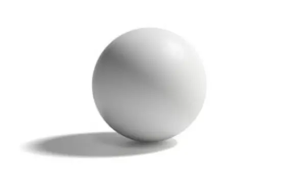
A circle is a shape. A sphere is a circle with form.
We make a sphere by adding variations in value within a circle.
By placing different values in specific locations, we create clues that tell us where the light originates from. This effect is what gives the illusion of three-dimensionality to flat surfaces.
Lights and Shadows in Landscape Photography
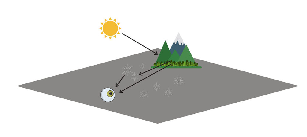
In images variations in light and shadow can be achieved using dodge and burn. How do we know which parts of the image should be light and which ones should be dark?
John Carlson provides an excellent explanation of values as applies to landscapes images in his book, Carlson’s Guide To Landscape Painting. To aid in understanding, I’ll be borrowing this explanation.
For the moment we’ll reduce our photo to a greyscale. Doing so will help us better understand the differences in values between the elements in a landscape.
That is the relative brightness between masses such as the mountain, sky, or ground.
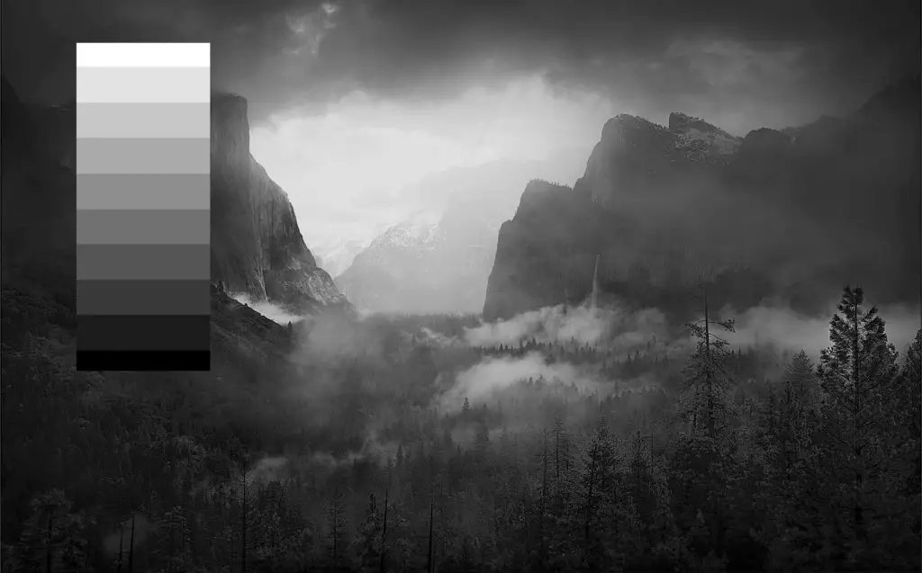
Carlson’s theory indicates that the variations of color values in landscapes is dictated by the angles at which these masses present themselves to the source of light.
The prime elements in our landscapes – trees, ground, mountains, etc. – receive light from the sky in differing degrees.
The differences in their slopes (plane) establish how bright they are relative to one another.
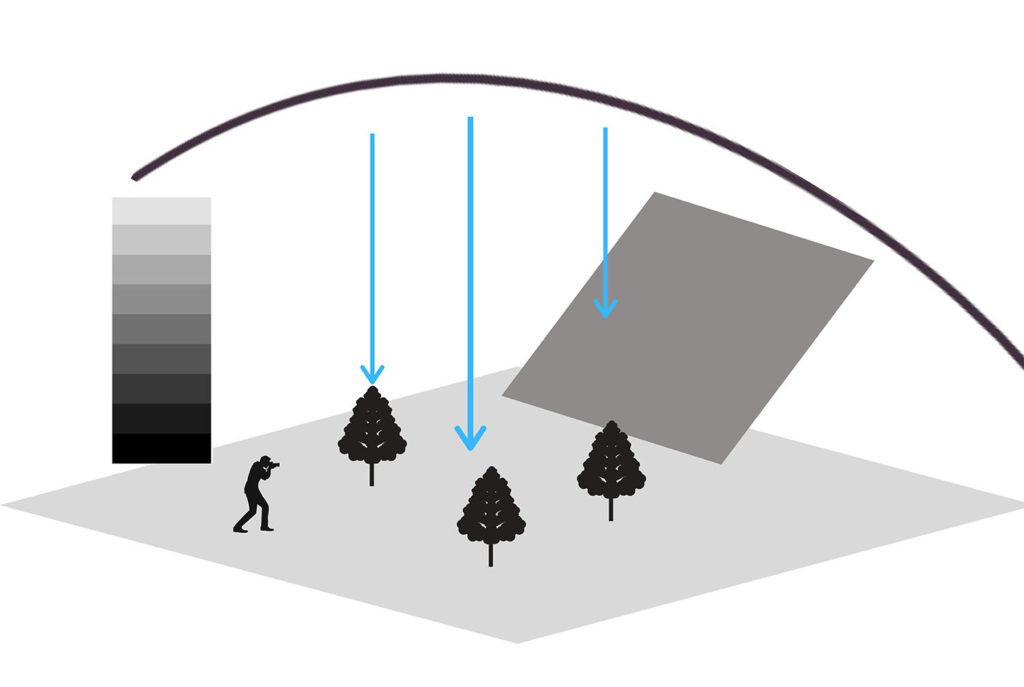
The Sky
To those who don’t practice photography, it may not be intuitive to think of the sky as an object.
Within the framework of an image, however, it is as much an object like trees or mountains.
The sky is the primary source of light in most landscape images. Thus, it is often the brightest object in a picture where it is present.
This is true even in cases where it’s cloudy or overcast. On overcast days, the clouds obstruct the light waves coming from the sun.
Any light obstructed by an overcast sky does not reach the objects below. This renders the objects darker and more somber than the sky above.
Also, the obstructed sunlight illuminates the clouds. This further increases its brightness relative to the rest of the scene.
Note: While the above statement is true when I take photos of bright, cloudy skies I often opt to make them darker. This is done to direct the focus of the viewer to the places I want their eyes drawn.
Darkening the sky in the image above is an aesthetic preference and has nothing to do Carlson’s theory.
The Ground
Due to its relatively flat nature, the ground receives the most light from the sky. As a result, the ground is the second brightest object in landscape scenes.
The Mountains
The mountains are the third brightest element. Because of their slanted angle, they receive less light than the ground. Thus they are semi-dark in value, laying somewhere between the value of the ground, and that of the trees.
The Trees
Trees receive the least amount of light. Thus, they are the darkest element in a landscape.
Because of their upright posture, they receive less light from the sky. This logically results in it being darker in value than the ground.
This is true even though the “local color” of the tree itself is bright. That is, trees will typically appear darker than other elements even if they possess bright colors such as green, orange, or yellow.
The bottom of the tree would be the location where we’d see the darkest elements since light can’t directly reach it.
Caveat:
Keep in mind that, Carlson’s theory is a crude guideline, and doesn’t always need to be followed.
For example, a tree doesn’t have to be the darkest element for your landscape image to have depth.
There are many factors that influence perceived depth such as distance and the direction of light. (I will expand on this more in the next sections)
Another factor to consider is the overall aesthetic you are trying to create.
As mentioned, though the sky is supposed to be the brightest, I often opt to make it a bit darker. I do this to guide the viewer’s attention throughout the image.
Light and Shadows + Dodge and Burn
Carlson’s theory of angles gives us a system to establish the values of elements in landscapes. That is the relative brightness between masses such as the mountain, sky, or ground.
In the image below I used Photoshop’s dodge and burn tool to control the values of different elements.
You can find the dodge and burn tools on the tools panel in photoshop.
![]()
The dodge tool will look like a black pushpin. Use the dodge tool to brighten certain areas of your image.
The burn tool, on the other hand, looks like a hand or closed fist. Use the burn to darken certain parts of your image.
It’s important to remember that the dodge and burn tool will desaturate your colors. To compensate, you can use the sponge tool.
If you are working with monochrome, you don’t have to worry about this.
2. Atmospheric Perspective
Atmospheric perspective or aerial perspective is a method of generating space and depth in an image. It is designed to mimic the effects that the atmosphere in real life has on our vision.
The atmosphere influences our vision in two main ways. First, it makes all objects lighter as they recede from our eyes. Second, it makes all colors, except white fade into the distance.
The physics of this phenomenon is beyond the scope of this article. But, essentially, as light waves travel through the atmosphere, they are intercepted and scattered by air molecules and particles.
You will be able to see far more information in the form of contrast in value in an object that is 5 feet from you, than one that is 25 feet from you.
The farther the light wave travels the more interference it experiences. More interference results in more loss of information.
Atmospheric Perspective + Dodge and Burn

Camera technology has come a long way from the camera obscura and analog cameras.
Although this is generally a good thing, the ability of cameras to produce sharp images has also translated to images lacking a sense of depth.
To bring depth back in an image, some photographers use atmospheric perspective. You can create this effect by adjusting the contrast, saturation, and brightness within your image.
As mentioned, as objects get further away, they gradually get lighter; they also progressively lose contrast and saturation.
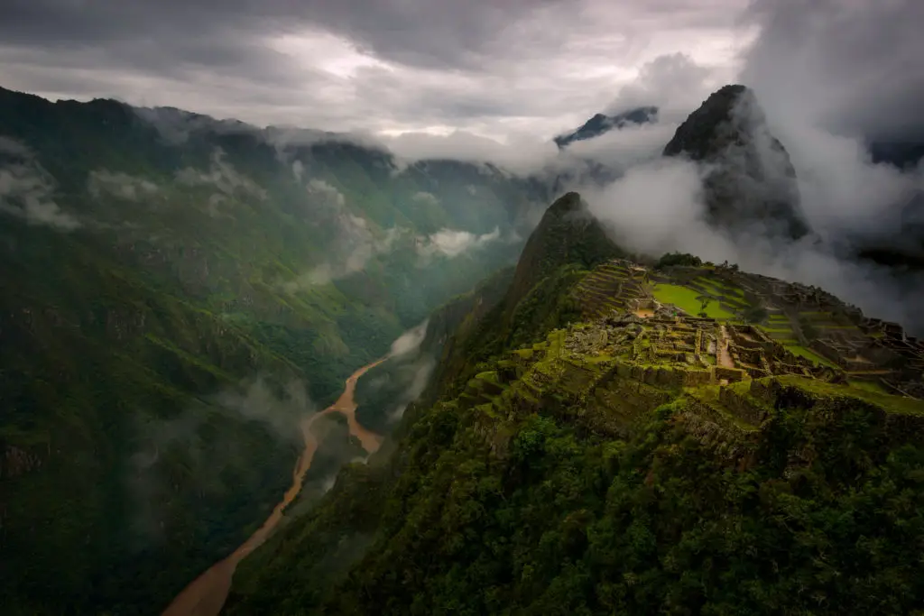
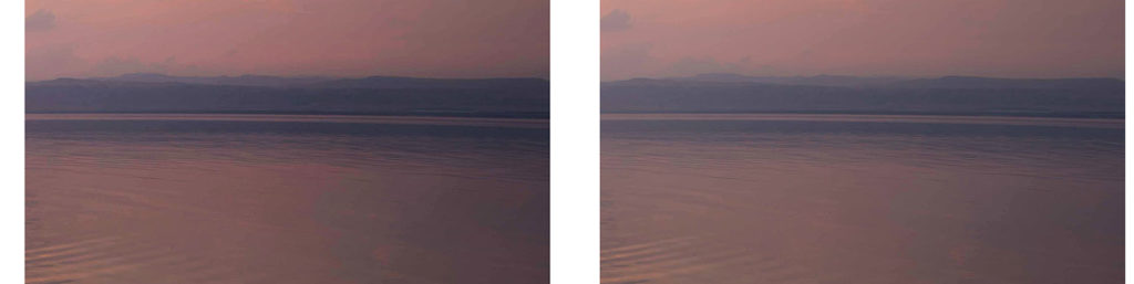
To generate this result in the image above, I used the Orton effect. In particular, I applied the Orton effect to lighten the mountain in the distance.
The Orton effect also added a blurry glow to the farthest mountain, decreasing its contrast and further emphasizing its distance.
Steps for applying the Orton Effect:
1. Duplicate your image. (Command + J or Ctrl +J)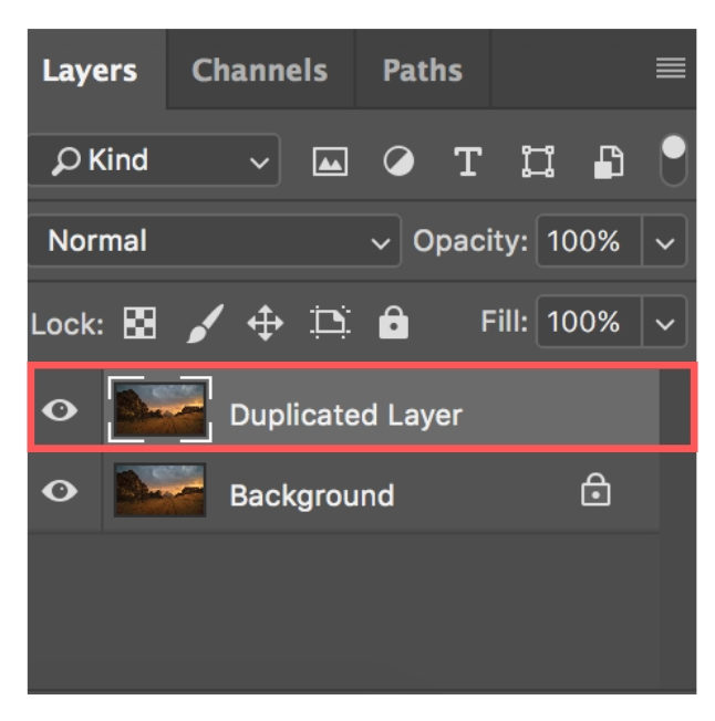
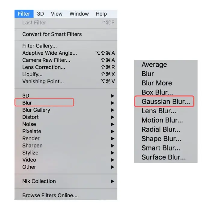
2. Change your blend from layer to screen. (This will give you the glow)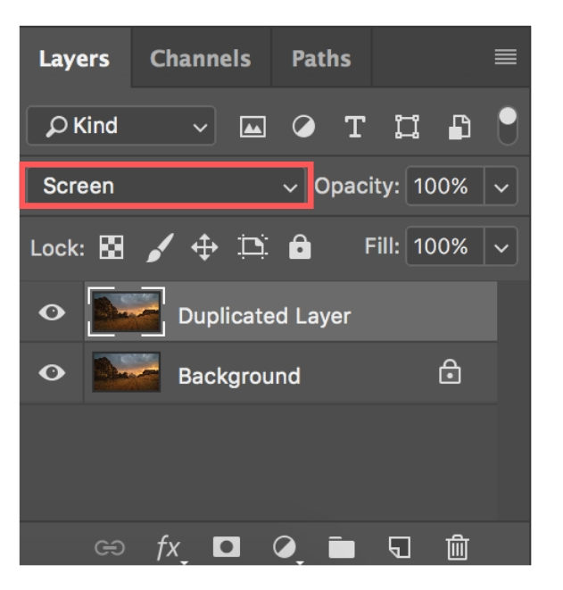 3. Open Gaussian Blur: Select filter→Blur→ Gaussian Blur.
4. Select a radius. A higher radius value will result in more blur.
5. Duplicate the Gaussian Blur layer.
→ This step serves to intensify the effects of the Gaussian Blur filter. You can skip it if you’re happy with the amount of sharpening using only one layer.
6. Select all the Gaussian Blur layers while pressing command/control.
7. Group the Gaussian Blur layers together by hitting the highlighted button in the image below.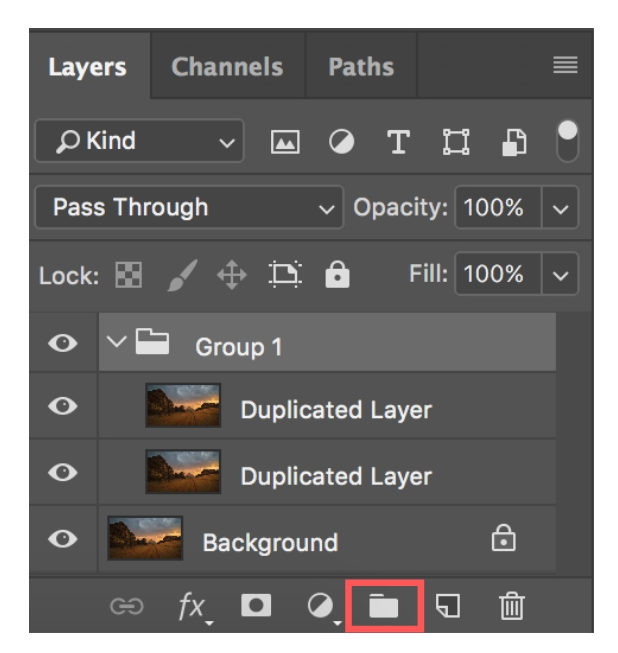
8. Apply a layer mask to the group. (Hold down Option/Alt when pressing the layer button to invert the layer)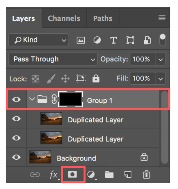
9. Use the Adjustment Brush to paint over the areas you want to apply the atmospheric perspective.
You can see that the contrast and saturation in my background are lower compared than my foreground.
By adding the Orton effect, I reduced the contrast present in the background of my image. By doing so, I increased the perception of space between my foreground and background, enhancing the depth in my image.
Note: There are several other ways that you can create the Orton effect, this is the simplest and quickest way in my opinion.
3. Contrast
Variations in the level of contrast between objects create an illusion of depth. Objects with a lot more contrast will appear closer than objects that have less.
Contrast is the difference between light and dark in an image. Distant objects will have less contrast, while closer objects will have more.
We said earlier that colors have a different gradation of brightness. We referred to this as the color value.
Colors that have drastically different values from each other have high contrast, while colors that are similar in value have low contrast.
The more contrast an object has, the closer it will appear to be.
Contrast + Dodge and Burn
A common method used to adjust contrast in post-processing is by using the contrast, sharpness, and clarity sliders.
The contrast slider adjusts the overall tonal range in your photo, making the lights brighter and the darks darker.
The clarity slider is a more intelligent version of the contrast slider in that it adjusts only the brightness level of the mid-tones in a photo.
The sharpness slider affects the contrast at a pixel level. That is, the sharpness slider makes the contrast between each pixel more or less pronounced.
Besides the sliders, the other common tools used to adjust contrast are levels and curves.
You can treat all the tools mentioned above as dodge and burn tools, as they function to alter relative brightness within your images.
If you would like to explore the difference between these sliders, I wrote an in-depth article here.
Dodge and Burn with High Pass Filter

To adjust the contrast in the image above, I used the High Pass filter. The High Pass filter is a sharpening tool available in Photoshop.
 Steps for applying the High Pass filter:

1. Duplicate your image.
2. Change your blend from average to soft light.
3. Open High Pass Filter: Select filter → Other →High Pass.
4. Choose a radius. The higher the radius, the higher the contrast.
→ The High Pass filter sharpens the white areas while leaving the grey areas unsharpened. If you want to know more about the High Pass filter, I wrote a more comprehensive article here.
5. Duplicate the high pass layer.
→ This step serves to intensify the effects of the High Pass filter. You can skip it if you’re happy with the amount of sharpening using only one layer
6. Select all the High Pass layers while pressing command/control.
7. Group the high pass layers together.
8. Apply a layer mask to the group. (Hold down Option/Alt when pressing the layer button to invert the layer)
9. Use the Adjustment Brush to paint over the areas you want to apply the filter.
I emphasized the texture of the rocks in the foreground using the highpass filter.
To further add depth, I also made the mountains in the background lighter with the dodge tool.
By adjusting the contrast in different areas of my images, I enhanced its perceived depth.
That is, by selectively adjusting contrast, I was able to progressively decrease the details in my image.
In the image, you’ll notice that the high-contrast available in the foreground rocks is absent in the background mountains. Also, notice that the water ripples also become less defined and somewhat blurry.
This gradual transition, from contrast to no contrast, helps elevate the presence of depth in this image.
By applying these filters, I used contrast to create depth. By making my foreground appear brighter, it seems closer, and by reducing the contrast in my background, it seems farther away.
Conclusion
Unlike other mediums in visual arts, images are static and two-dimensional.
The stories we tell through our images are dependent on our abilities to control the order in which our viewers will see the elements within them.
When using dodge and burn, keep in mind that a picture’s story begins with the brightest element.
The brightest element will always grab the viewer’s attention first.
The human eye is naturally drawn to lighter elements rather than darker ones. Thus, take care not to place the brightest part of your image away from your focal point.
Further, make sure that the contrasts between items in your image are clear and distinct. Having elements with equal values will confuse the viewer’s eye, leaving them uncertain where to look first.
Light is the essence of photography. And a solid understanding of how it interacts with matter will allow you to make better use of it.
Making use of variations of light as a deliberate and measured element to communicate your message is what separates the good photographs from the amazing ones.
Great post! It will help me a lot!